
TimeTrex product update
Meet the New TimeTrex: A Major UI Transformation
TimeTrex's major UI update brings a striking new design, a much richer collection of visual analytics, and redesigned workspaces for the tasks your business depends on. Interactive charts, clearer workflows, and more informative dashboards put the power of TimeTrex directly in view.
Product walkthrough 14 min read
Meet a more visual, more intuitive TimeTrex. From the first dashboard to the final stages of payroll, the updated interface brings a new level of clarity to workforce management.
The transformation reaches across the experience: dashboard layouts, graphs and charts, action panels, payroll windows, record editors, map tools, and the controls that connect them. Staffing trends sit alongside labor costs. Payroll history leads into detailed reports. Pending work has a prominent place. Familiar business functions come together in a modern, highly functional workspace.
For existing customers, this is an opportunity to get more visibility from the information already flowing through TimeTrex. For anyone taking another look at the platform, the new interface makes a compelling introduction to its depth. Here is what makes this update worth your attention.
A modern interface that brings TimeTrex's power forward
TimeTrex has long brought time and attendance, scheduling, payroll, and workforce administration together. This update gives that breadth a much stronger visual expression, with a design that makes information easier to scan and the next action easier to recognize.
The difference is immediately visible. Clean white cards, more generous spacing, clearer headings, coordinated icons, and carefully grouped controls give the application a contemporary appearance. The blue header and labeled navigation provide familiar reference points, while the main workspace gives each task room to breathe.
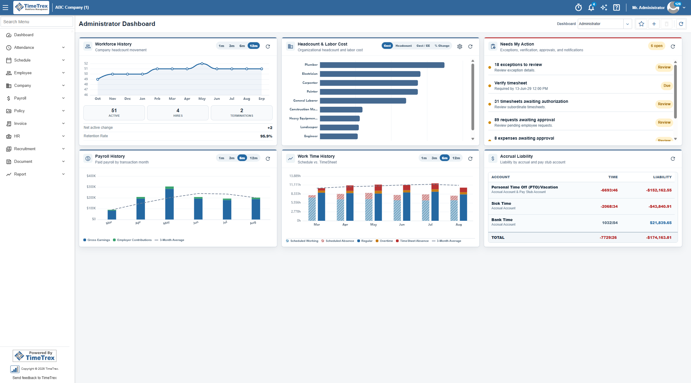
Earlier TimeTrex dashboards placed much of their emphasis on compact tables: exceptions, requests, schedules, messages, and timesheet verification. The new administrator dashboard expands that view dramatically. Workforce movement, labor-cost comparisons, payroll patterns, and scheduled-versus-worked time now share the screen with operational priorities. The business picture becomes much easier to see.
That is the significance of the redesign. The interface organizes the platform's depth around the way people review information and make decisions. A prominent chart reveals a trend. A status badge draws attention to pending work. A clearly labeled step explains where you are in payroll. A large map gives a location record immediate meaning.
If your impression of TimeTrex comes from its older screens, this is the moment to take another look. The updated experience pairs the platform's extensive functionality with the visual clarity people expect from modern business software.
Interactive analytics take center stage
The new dashboard is the strongest expression of that change. It brings together interactive graphs, comparison charts, key figures, and focused summaries so that workforce data becomes part of the everyday management experience.
Follow the movement behind your headcount
Workforce History combines a headcount graph with active employees, hires, terminations, net active change, and retention. Select a one-, three-, six-, or twelve-month range to examine recent movement or take a broader view of staffing.
The figures and chart respond to the selected period. That matters when a stable headcount hides a busy cycle of hiring and departures: the movement behind the total is visible alongside the trend. Leaders have a clearer basis for discussing recruitment, retention, and changes in workforce size.
Switch the perspective on labor costs
The Headcount & Labor Cost chart lets you switch between Cost, Headcount, Cost / EE, and % Change. Each view answers a different management question, using the same compact space on the dashboard.
Look at total cost to see where spending is concentrated. Switch to headcount to examine staffing distribution. Select cost per employee to compare groups from another angle. Use percentage change to focus on movement. In a view grouped by job title, for example, the roles with the largest total payroll may differ from those with the highest cost per employee.
That ability to change perspective is a meaningful functional improvement to the dashboard experience. The chart becomes a tool for exploring the workforce, with controls close to the information they affect.
Put payroll history into context
Payroll History presents paid payroll by transaction month, distinguishing gross earnings and employer contributions alongside a three-month average. Select a shorter or longer range to examine a recent change or the wider pattern.
The connection to detailed reporting is especially useful. Selecting the payroll chart opens a payroll history report for the chosen period, with pay-period totals for gross pay, deductions, net pay, and employer contributions. You can move from noticing a change to examining the figures behind it in the same application.
For an owner reviewing expenses or a payroll manager preparing for a discussion, this makes historical payroll information much more accessible during ordinary work.
See scheduled time beside recorded time
Work Time History compares schedules with timesheets in a visual timeline. The chart distinguishes scheduled working time, scheduled absence, regular time, overtime, and timesheet absence, with a three-month average for context.
This is a useful way to see where planned staffing and recorded hours diverge. A manager investigating a change in labor costs can examine the pattern of working time alongside payroll history, then review the relevant records. The dashboard brings related questions into one view: how many people are working, how much time is being recorded, and how payroll is changing.
Keep accrued time and liability visible
The Accrual Liability panel adds another dimension by showing time and liability by account. Links to related accrual and pay stub summaries connect the overview to supporting detail.
Together, these cards give TimeTrex a substantially richer analytical presence. Trends, comparisons, and financial context are visible as part of the working day, with detailed records close at hand when a question needs investigation.
Turn a busy dashboard into a clear action list
A modern dashboard should make responsibilities obvious. Needs My Action brings outstanding work together in a focused panel that sits alongside the analytics.
Exceptions, timesheet verification, timesheets awaiting authorization, employee requests, expense approvals, and unread notifications appear as clearly labeled entries. Counts and due information make the scale or timing of the work visible, while the action attached to each entry provides a direct route into review.
This is a significant change in emphasis from a dashboard filled with separate administrative tables. The new panel gathers different kinds of pending work into one place, making it easier to decide what deserves attention next.
For a manager, that might mean checking an absence request before reviewing coverage. For payroll, it might mean reviewing exceptions and outstanding timesheets before moving into the pay cycle. The dashboard brings those responsibilities into view alongside the broader business trends.
The result is an experience that combines oversight with action. You can understand what is happening across the workforce and see the items waiting for you, within the same organized workspace.
Find your way through a more coherent workspace
TimeTrex's breadth is valuable when its tools are easy to reach. The updated interface keeps major business areas in a recognizable navigation structure, including Attendance, Schedule, Employee, Company, Payroll, Policy, HR, and Report.
The Search Menu gives you a direct route when you know the task you want. Type "payroll" to find Process Payroll and Payroll Export, grouped under their relevant menu areas. Search for "geo" to reach GEO Fences under Attendance.
These familiar navigation capabilities now sit within a more polished application experience. The consistent header, labeled modules, and task-focused windows give users stable reference points as they move between different responsibilities. Notifications, help, and profile controls remain easy to recognize at the top of the application.
For experienced users, that continuity supports familiar routines. For colleagues learning TimeTrex, visible labels and searchable destinations make it easier to connect a business task with the screen that handles it. The full range of tools remains organized around recognizable areas of work.
A redesigned payroll experience with the whole process in view
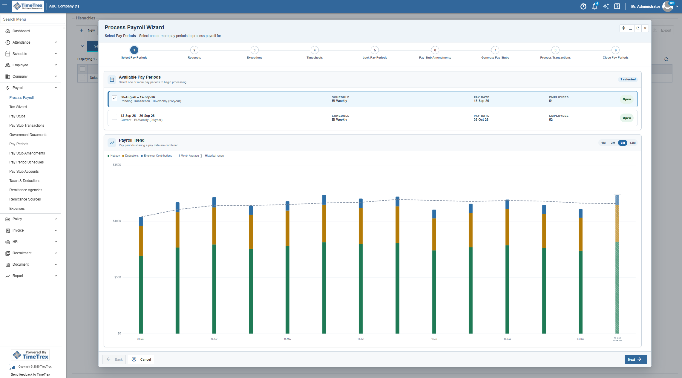
Payroll receives one of the most substantial visual transformations in the update. The Process Payroll Wizard brings a clearly labeled workflow, informative pay-period cards, and a payroll trend chart into a spacious, focused window.
See every stage by name
The workflow displays the current stage alongside the stages ahead:
- Select Pay Periods
- Requests
- Exceptions
- Timesheets
- Lock Pay Periods
- Pay Stub Amendments
- Generate Pay Stubs
- Process Transactions
- Close Pay Periods
The updated presentation makes the sequence explicit. Each stage has a name and position, the current step stands out, and the task description explains what belongs at that point in the process. Back, Cancel, and Next controls provide clear navigation.
For payroll teams, this creates a stronger shared view of the work. A colleague can see where timesheet review fits, when the process reaches pay stub generation, and what remains before the period is closed. Company configuration can determine which stages apply.
Choose a pay period with its details in view
Available pay periods appear as distinct cards with the dates, schedule, pay date, employee count, and status. Labels distinguish the current period from one awaiting its transaction date, and the selected state is easy to identify.
Those details belong together. When several periods are relevant, the payroll team can compare the dates and status at the point of selection. The layout gives an important administrative decision the space and clarity it deserves.
Bring visual analysis into payroll preparation
The Payroll Trend chart makes analytics part of the payroll workspace itself. It displays payroll by pay date, including net pay, deductions, employer contributions, and a three-month average. Range controls let you examine one, three, six, or twelve months, and projected amounts are identified when shown.
This gives payroll teams immediate context for reviewing a pay run. A change in the overall pattern is visible, so the team can investigate its causes in the underlying records. The chart supports review while the numbered workflow keeps the process organized.
The combination is compelling: a modern payroll workspace with both the administrative detail and the visual perspective needed to work confidently. It builds on TimeTrex's integrated payroll capabilities and makes that connected approach much more apparent on screen.
A more visual way to manage work locations
The updated GEO Fence editor brings the same design approach to location management. A large interactive map shares the workspace with the record's name, description, and color, giving administrators a clear view of the boundary they are managing.
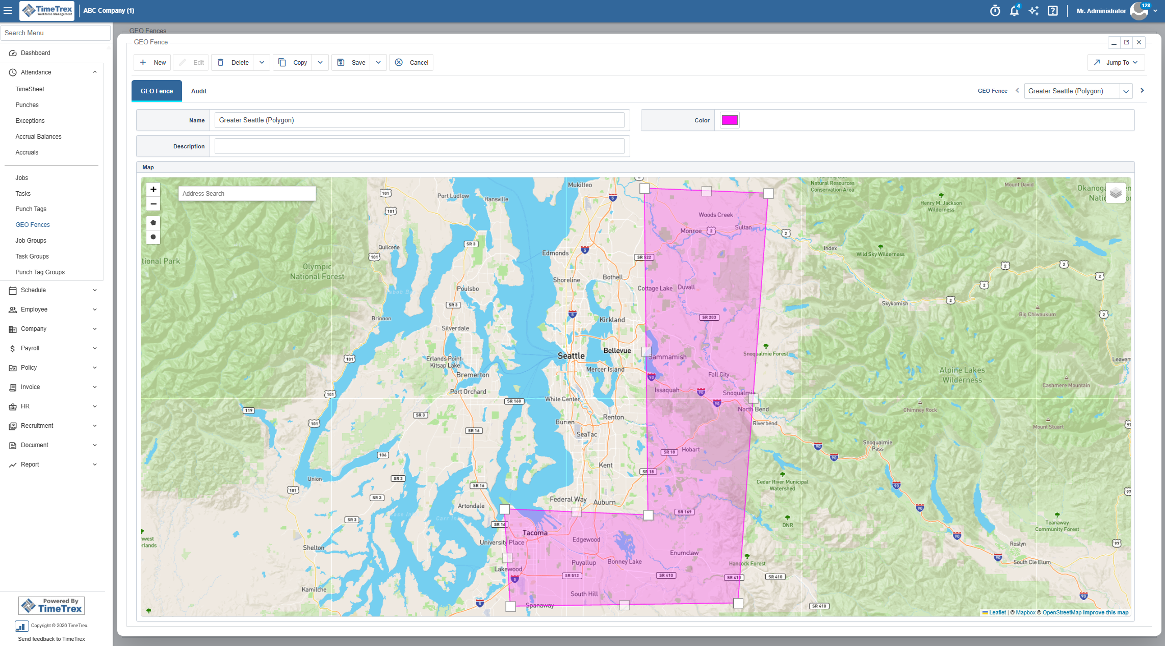
Address search, zoom controls, map layers, and polygon and circle tools sit alongside the geographic view. An administrator can examine a site in context while keeping its identifying details visible. GEO Fence and Audit tabs organize the record and its history, and labeled Save and Cancel controls make the editing actions clear.
For an organization with an office, a warehouse, and multiple field locations, that visual context is valuable. Each location has a shape that can be reviewed against the surrounding streets and worksite. A circular boundary suits a radius around a point; a polygon supports a more specific outline.
The new presentation makes an established TimeTrex capability easier to understand at a glance. Combined with the appropriate time and attendance configuration, geofences support location restrictions for clocking in and out. The redesigned editor puts the boundary itself at the center of that administrative task.
Clearer screens, more consistent controls
The benefits of a major UI update show up in the details people encounter repeatedly: opening a list, selecting a record, locating an action, moving between tabs, and recognizing what will happen next.
The refreshed interface gives those interactions a more consistent visual structure. Record lists use clearly grouped action bars. Editing windows have recognizable titles and controls. Tabs separate related information, and selection indicators make the active context visible.
In the GEO Fences workspace, for example, New, View, Edit, Copy, and Map actions belong to the record list. Search and Saved Search & Layout areas support finding and organizing records. Inside an editor, the record details, map, tabs, and navigation work together within a defined window.
That coherence addresses a practical source of interface friction: having to work out where a task or control belongs every time the screen changes. Clearer groupings and consistent visual cues help users recognize the structure of their work across different functions.
The same principle carries through to the dashboard and payroll wizard. Information has a clear hierarchy, actions have recognizable labels, and the current context is visible. TimeTrex now presents its extensive capabilities in an interface that feels modern and purposeful throughout these core workflows.
Build a dashboard around the work you do
The updated dashboard experience extends well beyond the administrator overview. A broad selection of dashlets, the individual cards that make up a dashboard, brings operational information, analytics, and personal work details into configurable views.
More visibility across the business
Available cards cover Exception History, Payroll Readiness, Pay Period Comparison, Upcoming Schedule, and Who's In/Out, among other operational priorities. The Exception History preview, for example, presents recent exceptions by severity with one-, two-, and four-week controls and an average for the last seven days.
The selection also reaches into HR: Employee Review Coverage, Qualification Renewals, and Recruitment Pipeline make review activity, upcoming qualifications, vacancies, and applications part of the dashboard conversation. These options give different teams ways to surface the information relevant to their responsibilities.
A more useful personal overview
Personal dashlets include Today & Next Shift, Current Pay Period, My Accrual Balances, My Requests, My Pay History, and My Work Time History. The range supports a dashboard focused on an individual's schedule, recorded time, pay history, and outstanding requests.
For employees, that creates a useful connection between everyday activity and the information they want to check. For managers and administrators, the wider catalog offers room to combine immediate responsibilities with historical perspective.
Choose, configure, and preview
The Add Dashlet workflow guides you through Choose Dashlet, Configure, and Preview. Its searchable selection list explains the available cards, and the preview stage lets you review a card before adding it. Configuration includes presentation options such as width and automatic refresh where offered.
Dashboard selection, creation, and default controls support different starting views. Custom List and Custom Report options also provide ways to surface available dashboard sources or saved and template reports. Available content follows your permissions, modules, and configuration.
This flexibility is an important part of the update's appeal. The interface can give different responsibilities an appropriate view, with a much broader range of information to bring forward.
A major upgrade for the people using TimeTrex every day
The redesigned screens become even more valuable when they work together. Analytics guide a question, a report supplies the detail, and the relevant workflow provides the place to act.
For business owners: a clearer view of the workforce. See staffing movement, labor-cost comparisons, payroll trends, and accrued-time liability together. Bring a visual overview into conversations about growth, staffing, and operating costs.
For payroll teams: more context throughout the pay cycle. Review outstanding work, identify the relevant pay periods, and follow a clearly presented process. Historical charts and supporting reports add perspective to payroll preparation.
For managers and HR teams: priorities within reach. Combine pending approvals with attendance, schedule, qualification, recruitment, or review information relevant to your role. Use the dashboard to connect immediate responsibilities with patterns that deserve attention.
For administrators: a more coherent working environment. Search for a destination, recognize the available actions, and review records in organized windows. The updated presentation makes the breadth of TimeTrex easier to navigate and explain to colleagues.
Across those roles, the value is consistent: more information made visible, more context around everyday decisions, and a modern interface that gives TimeTrex's functionality the presentation it deserves.
Experience the new TimeTrex
TimeTrex's major UI transformation changes the way the platform presents information and guides everyday work. The expanded visual analytics, redesigned payroll experience, more focused action panels, and cohesive workspaces make this a substantial step forward for the product.
Existing customers have new ways to explore workforce trends and bring relevant information into their daily routine. Businesses evaluating TimeTrex can experience its connected workforce capabilities through a modern interface built around practical work.
The best way to appreciate the update is to see the interaction: switch a chart from labor cost to headcount, change a historical range, open the payroll detail behind a trend, and explore the redesigned payroll and location workspaces.
See what the new TimeTrex can bring to your team. Request a personalized TimeTrex demo
Screens illustrate the updated interface. Available modules, dashboard content, permissions, and rollout timing depend on your TimeTrex environment. Contact TimeTrex for details specific to your organization.
Frequently asked questions
What makes this a major TimeTrex UI update?
The update combines a substantial visual redesign with a much richer dashboard experience. Interactive workforce and payroll charts, clearer action panels, redesigned payroll windows, organized record editors, and visual location management bring more information and functionality into a cohesive modern workspace.
Are the new dashboard charts interactive?
Yes. Historical charts offer selectable time ranges, and Headcount & Labor Cost switches between cost, headcount, cost per employee, and percentage change. The Payroll History chart also opens a detailed report for the selected period, connecting the visual overview with supporting figures.
Can different teams have different dashboard views?
The dashboard experience includes selection, creation, default, and Add Dashlet controls. Available cards cover personal information, attendance, payroll, HR, and reporting. The Add Dashlet workflow includes configuration and a preview before adding a card. Options depend on permissions and enabled modules.
How has the payroll experience changed?
The redesigned Process Payroll Wizard displays named stages, clear progress through the workflow, informative pay-period selection cards, and an integrated payroll trend chart. It gives the established payroll process a more visual, organized presentation with historical context in the same workspace.
How can I explore the updated TimeTrex?
Request a personalized demonstration to see the dashboards and workflows relevant to your team, or contact TimeTrex to discuss availability for your environment.